The movie industry is a vastly competitive market with each
producer clawing their way to the top of the box office. While many
marketing strategies can be used to draw in movie viewers, few are
more effective than the designs used in a movie's promotional
materials. In particular, the typography, or screen fonts, used in a movie's marketing materials such as posters and commercials can either make
or break its popularity. As such, here are eight current examples of effective movie fonts and why they work so well in each context.
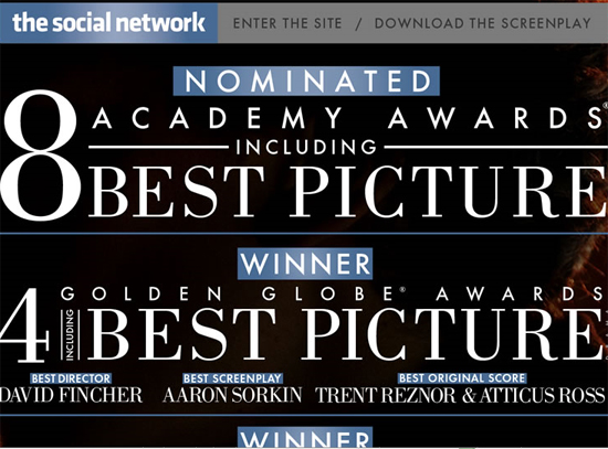 The producers of The Social Network chose great screen
fonts to use in their various marketing materials, including their
website. What makes this movie's font usage so perfect is it
collaboration with the font from Facebook's logo, which is the social network at the center of this movie's focus.

The screen font choice for the movie, Let Me In, was a wonderful option. It immediately portrays the film's genre and alerts viewers that they are in for a creepy adventure when heading to the theatre. The screen font colors also lend to the overall spooky feel.
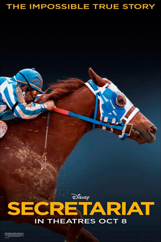
The screen font used for Secretariat is yet another example of how a movie poster's typography can speak to an intended audience. This poster's font relays a friendly, young-natured attitude, perfect for its younger target audience.

The movie cover for 27 dresses is a wonderful example of how typography can be used in fun, playful ways to draw in target audience members. This font tells viewers that they are in for a light-hearted comical adventure when renting the movie.
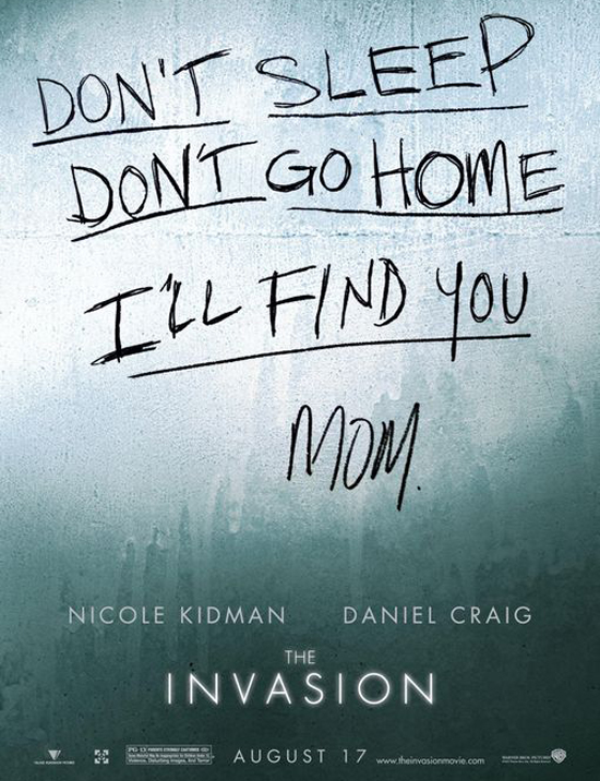
While handwritten fonts are often friendly and inviting, the handwritten screen font in this poster for The Invasion has an alternate intended effect. When combined with the overall poster design, the font is clearly intended to spook viewers and draw in lovers of horror films.
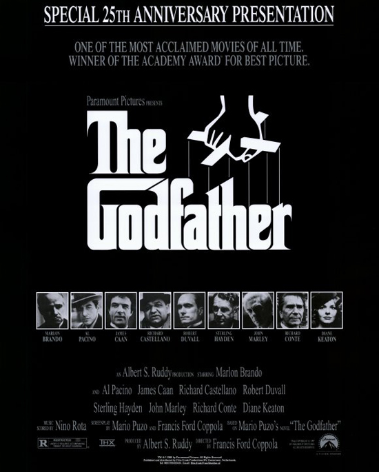
Sometimes, when a screen font is used for a particularly popular film, it becomes iconic and will forever be associated with that movie. The screen font used for The Godfather is a perfect example of a font's sudden popularity.

Sometimes, all that is needed in a movie poster is the clever use of typography as shown in this poster for The Gangs of New York. When combined with deep texturing, this screen font effectively achieves its intended purpose.
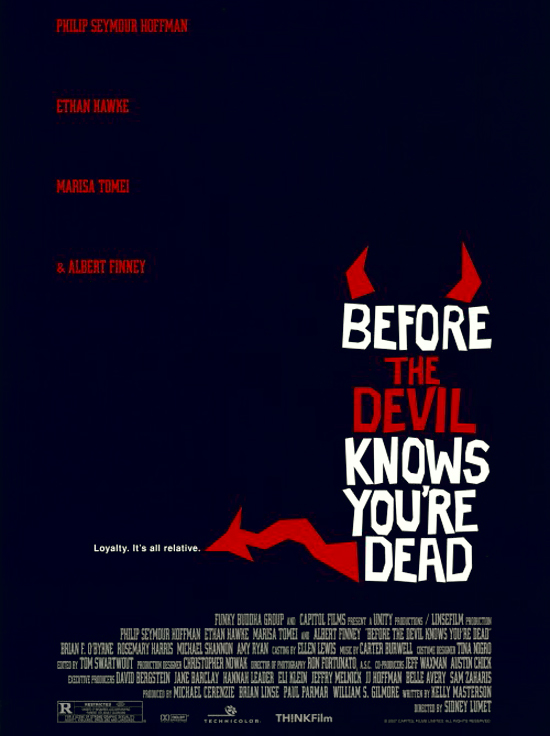
This movie poster makes great use of white space with its screen font placement. The playful, yet creepy font style was a wonderful choice to portray this movie's genre.
Screen font decisions can either make or break a movie's popularity. With a little creativity and attention to detail, movie promotional designers can enhance their products specifically through their typographical decisions. Marketing materials from movies such as The Social Network are perfect examples of how the screen fonts that are used can make a movie's theme immediately recognizable to audience members.
Sonia Mansfield is the content editor for PsPrint and editor of PsPrint Design Blog. PsPrint is an online commercial printing company specialize in brochure printing.
The Social Network

Let Me In

The screen font choice for the movie, Let Me In, was a wonderful option. It immediately portrays the film's genre and alerts viewers that they are in for a creepy adventure when heading to the theatre. The screen font colors also lend to the overall spooky feel.
Secretariat

The screen font used for Secretariat is yet another example of how a movie poster's typography can speak to an intended audience. This poster's font relays a friendly, young-natured attitude, perfect for its younger target audience.
27 Dresses

The movie cover for 27 dresses is a wonderful example of how typography can be used in fun, playful ways to draw in target audience members. This font tells viewers that they are in for a light-hearted comical adventure when renting the movie.
The Invasion

While handwritten fonts are often friendly and inviting, the handwritten screen font in this poster for The Invasion has an alternate intended effect. When combined with the overall poster design, the font is clearly intended to spook viewers and draw in lovers of horror films.
The Godfather

Sometimes, when a screen font is used for a particularly popular film, it becomes iconic and will forever be associated with that movie. The screen font used for The Godfather is a perfect example of a font's sudden popularity.
The Gangs of New York

Sometimes, all that is needed in a movie poster is the clever use of typography as shown in this poster for The Gangs of New York. When combined with deep texturing, this screen font effectively achieves its intended purpose.
Before the Devil Knows You're Dead

This movie poster makes great use of white space with its screen font placement. The playful, yet creepy font style was a wonderful choice to portray this movie's genre.
Screen font decisions can either make or break a movie's popularity. With a little creativity and attention to detail, movie promotional designers can enhance their products specifically through their typographical decisions. Marketing materials from movies such as The Social Network are perfect examples of how the screen fonts that are used can make a movie's theme immediately recognizable to audience members.
Sonia Mansfield is the content editor for PsPrint and editor of PsPrint Design Blog. PsPrint is an online commercial printing company specialize in brochure printing.
Interesting Post!
ReplyDelete